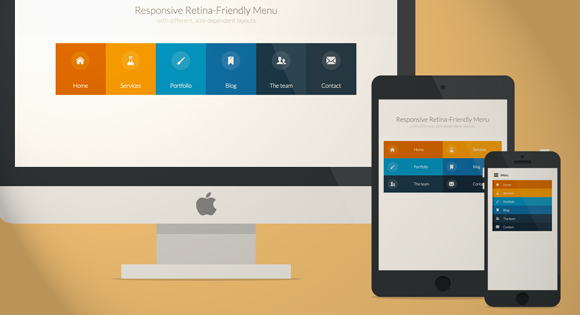
Делаем адаптивное меню с поддержкой Ретина дисплеев
Отличный урок, в котором Вы узнаете как сделать красивое и адаптивное меню на CSS с поддержкой Ретина экранов.
HTML-код меню
Код
<nav id="menu" class="nav">
<ul>
<li>
<a href="#" title="">
<span class="icon"> <i aria-hidden="true" class="icon-home"></i></span><span>Home</span>
</a>
</li>
<li>
<a href="#" title=""><span class="icon"> <i aria-hidden="true" class="icon-services"></i></span><span>Services</span></a>
</li>
<li>
<a href="#" title=""><span class="icon"><i aria-hidden="true" class="icon-portfolio"></i></span><span>Portfolio</span></a>
</li>
<li>
<a href="#" title=""><span class="icon"><i aria-hidden="true" class="icon-blog"></i></span><span>Blog</span></a>
</li>
<li>
<a href="#" title=""><span class="icon"><i aria-hidden="true" class="icon-team"></i></span><span>The team</span></a>
</li>
<li>
<a href="#" title=""><span class="icon"><i aria-hidden="true" class="icon-contact"></i></span><span>Contact</span></a>
</li>
</ul>
</nav>
CSS & JavaScript
Код
/* Global CSS that are applied for all screen sizes */
.nav ul { max-width: 1240px; margin: 0; padding: 0; list-style: none; font-size: 1.5em; font-weight: 300; }
.nav li span { display: block; }
.nav a { display: block; color: rgba(249, 249, 249, .9);
text-decoration: none; transition: color .5s, background .5s, height .5s; }
.nav i{ /* Make the font smoother for Chrome */
transform: translate3d(0, 0, 0); }
/* Remove the blue Webkit background when element is tapped */
a, button { -webkit-tap-highlight-color: rgba(0,0,0,0); }
/* Hover effect for the whole navigation to make the hovered item stand out */
.no-touch .nav ul:hover a { color: rgba(249, 249, 249, .5); }
.no-touch .nav ul:hover a:hover { color: rgba(249, 249, 249, 0.99); }
.nav li:nth-child(6n+1) { background: rgb(208, 101, 3); }
.nav li:nth-child(6n+2) { background: rgb(233, 147, 26); }
.nav li:nth-child(6n+3) { background: rgb(22, 145, 190); }
.nav li:nth-child(6n+4) { background: rgb(22, 107, 162); }
.nav li:nth-child(6n+5) { background: rgb(27, 54, 71); }
.nav li:nth-child(6n+6) { background: rgb(21, 40, 54); }
@media (min-width: 50em) {
/* Transforms the list into a horizontal navigation */
.nav li { float: left; width: 16.66666666666667%; text-align: center; transition: border .5s; }
.nav a { display: block; width: auto; }
/* hover, focused and active effects that add a little colored border to the different items */
.no-touch .nav li:nth-child(6n+1) a:hover,
.no-touch .nav li:nth-child(6n+1) a:active,
.no-touch .nav li:nth-child(6n+1) a:focus { border-bottom: 4px solid rgb(174, 78, 1); }
.no-touch .nav li:nth-child(6n+2) a:hover,
.no-touch .nav li:nth-child(6n+2) a:active,
.no-touch .nav li:nth-child(6n+2) a:focus { border-bottom: 4px solid rgb(191, 117, 20); }
.no-touch .nav li:nth-child(6n+3) a:hover,
.no-touch .nav li:nth-child(6n+3) a:active,
.no-touch .nav li:nth-child(6n+3) a:focus { border-bottom: 4px solid rgb(12, 110, 149); }
.no-touch .nav li:nth-child(6n+4) a:hover,
.no-touch .nav li:nth-child(6n+4) a:active,
.no-touch .nav li:nth-child(6n+4) a:focus { border-bottom: 4px solid rgb(10, 75, 117); }
.no-touch .nav li:nth-child(6n+5) a:hover,
.no-touch .nav li:nth-child(6n+5) a:active,
.no-touch .nav li:nth-child(6n+5) a:focus { border-bottom: 4px solid rgb(16, 34, 44); }
.no-touch .nav li:nth-child(6n+6) a:hover,
.no-touch .nav li:nth-child(6n+6) a:active,
.no-touch .nav li:nth-child(6n+6) a:focus { border-bottom: 4px solid rgb(9, 18, 25); }
/* Placing the icon */
.icon { padding-top: 1.4em; }
.icon + span { margin-top: 2.1em; transition: margin .5s; }
/* Animating the height of the element*/
.nav a { height: 9em; }
.no-touch .nav a:hover ,
.no-touch .nav a:active ,
.no-touch .nav a:focus { height: 10em; }
/* Making the text follow the height animation */
.no-touch .nav a:hover .icon + span { margin-top: 3.2em; transition: margin .5s; }
/* Positioning the icons and preparing for the animation*/
.nav i { position: relative; display: inline-block; margin: 0 auto; padding: 0.4em; border-radius: 50%; font-size: 1.8em; box-shadow: 0 0 0 0.8em transparent; background: rgba(255,255,255,0.1); transform: translate3d(0, 0, 0); transition: box-shadow .6s ease-in-out; }
/* Animate the box-shadow to create the effect */
.no-touch .nav a:hover i,
.no-touch .nav a:active i,
.no-touch .nav a:focus i { box-shadow: 0 0 0px 0px rgba(255,255,255,0.2); transition: box-shadow .4s ease-in-out; }
}
@media (min-width: 50em) and (max-width: 61.250em) {
/* Size and font adjustments to make it fit better */
.nav ul { font-size: 1.2em; }
}
/* The "tablet" and "mobile" version */
@media (max-width: 49.938em) {
/* Instead of adding a border, we transition the background color */
.no-touch .nav ul li:nth-child(6n+1) a:hover,
.no-touch .nav ul li:nth-child(6n+1) a:active,
.no-touch .nav ul li:nth-child(6n+1) a:focus { background: rgb(227, 119, 20); }
.no-touch .nav li:nth-child(6n+2) a:hover,
.no-touch .nav li:nth-child(6n+2) a:active,
.no-touch .nav li:nth-child(6n+2) a:focus { background: rgb(245, 160, 41); }
.no-touch .nav li:nth-child(6n+3) a:hover,
.no-touch .nav li:nth-child(6n+3) a:active,
.no-touch .nav li:nth-child(6n+3) a:focus { background: rgb(44, 168, 219); }
.no-touch .nav li:nth-child(6n+4) a:hover,
.no-touch .nav li:nth-child(6n+4) a:active,
.no-touch .nav li:nth-child(6n+4) a:focus { background: rgb(31, 120, 176); }
.no-touch .nav li:nth-child(6n+5) a:hover,
.no-touch .nav li:nth-child(6n+5) a:active,
.no-touch .nav li:nth-child(6n+5) a:focus { background: rgb(39, 70, 90); }
.no-touch .nav li:nth-child(6n+6) a:hover,
.no-touch .nav li:nth-child(6n+6) a:active,
.no-touch .nav li:nth-child(6n+6) a:focus { background: rgb(32, 54, 68); }
.nav ul li { transition: background 0.5s; }
}
/* CSS for a 2x3 columns version */
@media (min-width: 32.5em) and (max-width: 49.938em) {
/* Creating the 2 column layout using floating elements once again */
.nav li { display: block; float: left; width: 50%; }
/* Adding some padding to make the elements look nicer*/
.nav a { padding: 0.8em; }
/* Displaying the icons on the left, and the text on the right side using inline-block */
.nav li span,
.nav li span.icon { display: inline-block; }
.nav li span.icon { width: 50%; }
.nav li .icon + span { font-size: 1em; }
.icon + span { position: relative; top: -0.2em; }
/* Adapting the icons to animate the size and border of the rounded background in a more discreet way */
.nav li i { display: inline-block; padding: 8% 9%; border: 4px solid transparent; border-radius: 50%; font-size: 1.5em; background: rgba(255,255,255,0.1); transition: border .5s; }
/* Transition effect on the border color */
.no-touch .nav li:hover i,
.no-touch .nav li:active i,
.no-touch .nav li:focus i { border: 4px solid rgba(255,255,255,0.1); }
}
/* Adapting the font size and width for smaller screns*/
@media (min-width: 32.5em) and (max-width: 38.688em) {
.nav li span.icon { width: 50%; }
.nav li .icon + span { font-size: 0.9em; }
}
/* Styling the toggle menu link and hiding it */
.nav .navtoogle{ display: none; width: 100%; padding: 0.5em 0.5em 0.8em; font-family: 'Lato',Calibri,Arial,sans-serif; font-weight: normal; text-align: left; color: rgb(7, 16, 15); font-size: 1.2em; background: none; border: none; border-bottom: 4px solid rgb(221, 221, 221); cursor: pointer; }
.navtoogle i{ z-index:-1; }
.icon-menu { position: relative; top: 3px; line-height: 0; font-size: 1.6em; }
@media (max-width: 32.438em) {
/* Unhiding the styled menu link */
.nav .navtoogle{ margin: 0; display: block; }
/* Animating the height of the navigation when the button is clicked */
/* If JavaScript is disabled, the menu stays open */
.no-js .nav ul { max-height: 30em; overflow: hidden; }
/* When JavaScript is enabled, we hide the menu */
.js .nav ul { max-height: 0em; overflow: hidden; }
/* Displaying the menu when the user has clicked on the button */
.js .nav .active + ul { max-height: 30em; overflow: hidden; transition: max-height .4s; }
/* Adapting the layout of the menu for smaller screens: icon on the left and text on the right */
.nav li span { display: inline-block; height: 100%; }
.nav a { padding: 0.5em; }
.icon + span { margin-left: 1em; font-size: 0.8em; }
/* Adding a left border of 8 px with a different color for each menu item*/
.nav li:nth-child(6n+1) { border-left: 8px solid rgb(174, 78, 1); }
.nav li:nth-child(6n+2) { border-left: 8px solid rgb(191, 117, 20); }
.nav li:nth-child(6n+3) { border-left: 8px solid rgb(13, 111, 150); }
.nav li:nth-child(6n+4) { border-left: 8px solid rgb(10, 75, 117); }
.nav li:nth-child(6n+5) { border-left: 8px solid rgb(16, 34, 44); }
.nav li:nth-child(6n+6) { border-left: 8px solid rgb(9, 18, 25); }
/* make the nav bigger on touch screens */
.touch .nav a { padding: 0.8em; }
}
Код
<script type="text/javascript">
// The function to change the class
var changeClass = function (r,className1,className2) {
var regex = new RegExp("(?:^|\\s+)" + className1 + "(?:\\s+|$)");
if( regex.test(r.className) ) {
r.className = r.className.replace(regex,' '+className2+' ');
}
else{
r.className = r.className.replace(new RegExp("(?:^|\\s+)" + className2 + "(?:\\s+|$)"),' '+className1+' ');
}
return r.className;
};
// Creating our button for smaller screens
var menuElements = document.getElementById('menu');
menuElements.insertAdjacentHTML('afterBegin','<button type="button" id="menutoggle" class="navtoogle" aria-hidden="true"><i aria-hidden="true" class="icon-menu"> </i> Menu</button>');
// Toggle the class on click to show / hide the menu
document.getElementById('menutoggle').onclick = function() {
changeClass(this, 'navtoogle active', 'navtoogle');
}
// document click to hide the menu
// http://tympanus.net/codrops/2013/05/08/responsive-retina-ready-menu/comment-page-2/#comment-438918
document.onclick = function(e) {
var mobileButton = document.getElementById('menutoggle'),
buttonStyle = mobileButton.currentStyle ? mobileButton.currentStyle.display : getComputedStyle(mobileButton, null).display;
if(buttonStyle === 'block' && e.target !== mobileButton && new RegExp(' ' + 'active' + ' ').test(' ' + mobileButton.className + ' ')) {
changeClass(mobileButton, 'navtoogle active', 'navtoogle');
}
}
</script>
Вставить в head
Код
<script src="http://tympanus.net/Tutorials/ResponsiveRetinaReadyMenu/js/modernizr.custom.js"></script>
Загрузите на сайт скрипт «modernizr.custom.js».
Всего комментариев: (0)
Чтобы оставить комментарий под этой публикацией, войдите или зарегистрируйтесь.